If You Haven’t Considered Dark Green for Your Kitchen, These 6 Shades Will Convince You
Dark green is having a moment, and for good reason. It’s sophisticated, inviting, and versatile—qualities that make it a standout choice for kitchens. Whether you’re repainting cabinets, updating walls, or adding an accent, dark green adds a rich layer of depth that other colors can’t quite replicate. And aside from being trendy, it’s timeless and offers a balance of warmth and drama that feels at home in both modern and classic designs. If you’re curious about trying it but unsure where to start, I’ve got you covered.
Why Dark Green Deserves a Spot in Your Kitchen
Dark green has a way of transforming a kitchen into something special. The rich, bold shades of this color don’t just fill a space—they shape it and turn it into something that feels natural and inviting. Dark green finds its place effortlessly in every kind of kitchen – be it modern, rustic, or classic.
What makes it stand out is its ability to shift with the light. During the day, it’s vibrant and full of energy, while in the evening, it takes on a cozy, intimate tone. It’s a color that adapts, highlighting your kitchen’s best features without stealing the spotlight.
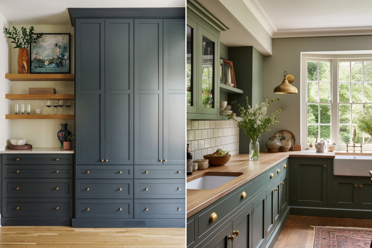
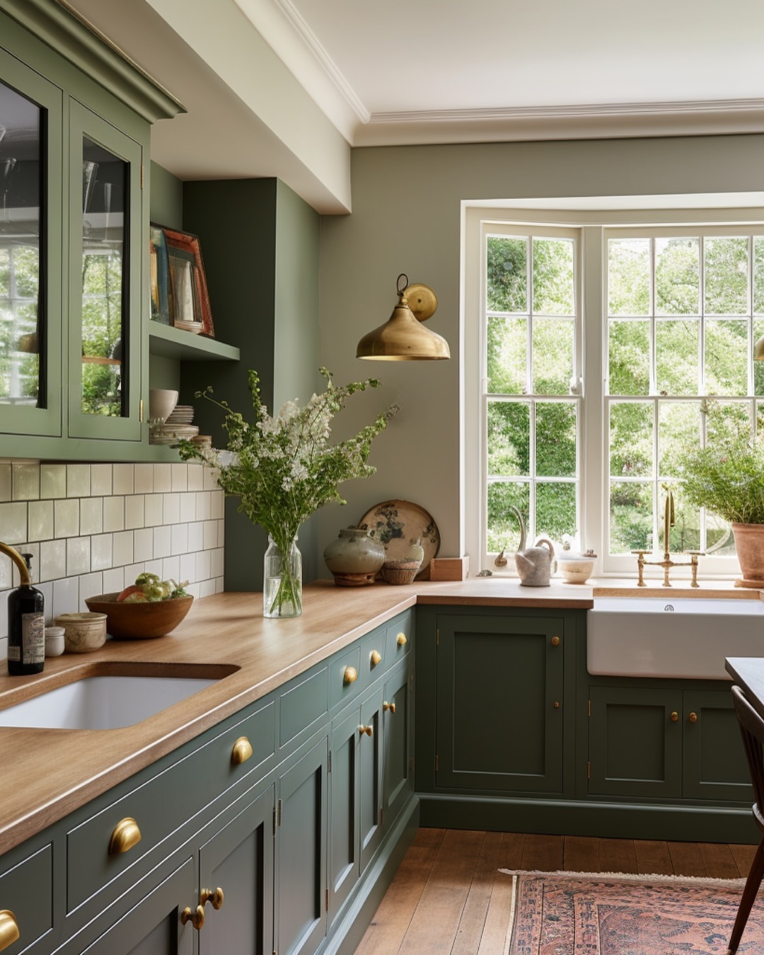
Ripe Olive (SW 6209) by Sherwin-Williams
If you want a green that feels versatile and grounded, Ripe Olive is a fantastic option. This shade toes the line between green and gray, creating a neutral backdrop that’s anything but boring. It works wonders on cabinetry, especially when paired with warm wood tones or a classic white marble countertop.
What I love about Ripe Olive is its adaptability—it doesn’t scream for attention, but it doesn’t fade into the background either. It’s the kind of green that feels like it belongs, whether your kitchen is sleek and contemporary or rustic and cozy. For a balanced look, try it with brass hardware and soft white walls.
Boreal Forest AF-480 by Benjamin Moore
Boreal Forest leans into the moody, dramatic side of green. It’s deep, bold, and has just a touch of blue that gives it a cool, sophisticated edge. This color shines as a wall paint in kitchens with plenty of natural light. Think of it as the perfect complement to lighter elements like quartz countertops or natural wood floors.
If you’re going for a modern feel, pair Boreal Forest with matte black fixtures or stainless steel appliances. Its richness doesn’t just make a statement—it transforms the entire room into a space you’ll want to spend time in.
Peale Green HC-121 by Benjamin Moore
Peale Green is a stunning, historical shade with timeless appeal. This color is a bit brighter than other dark greens, thanks to its subtle yellow undertones, which make it feel warm and approachable. It’s a great pick if you’re looking for a green that livens up your kitchen but still keeps it grounded. Use it on cabinets for a bold, fresh look, or as an accent wall to add depth to the space.
What makes Peale Green special is how it responds to natural light—sunlight brings out its brightness, while shadowed areas emphasize its deeper tones. Pair it with brushed nickel hardware and soft cream accents for a look that’s timeless and full of personality.
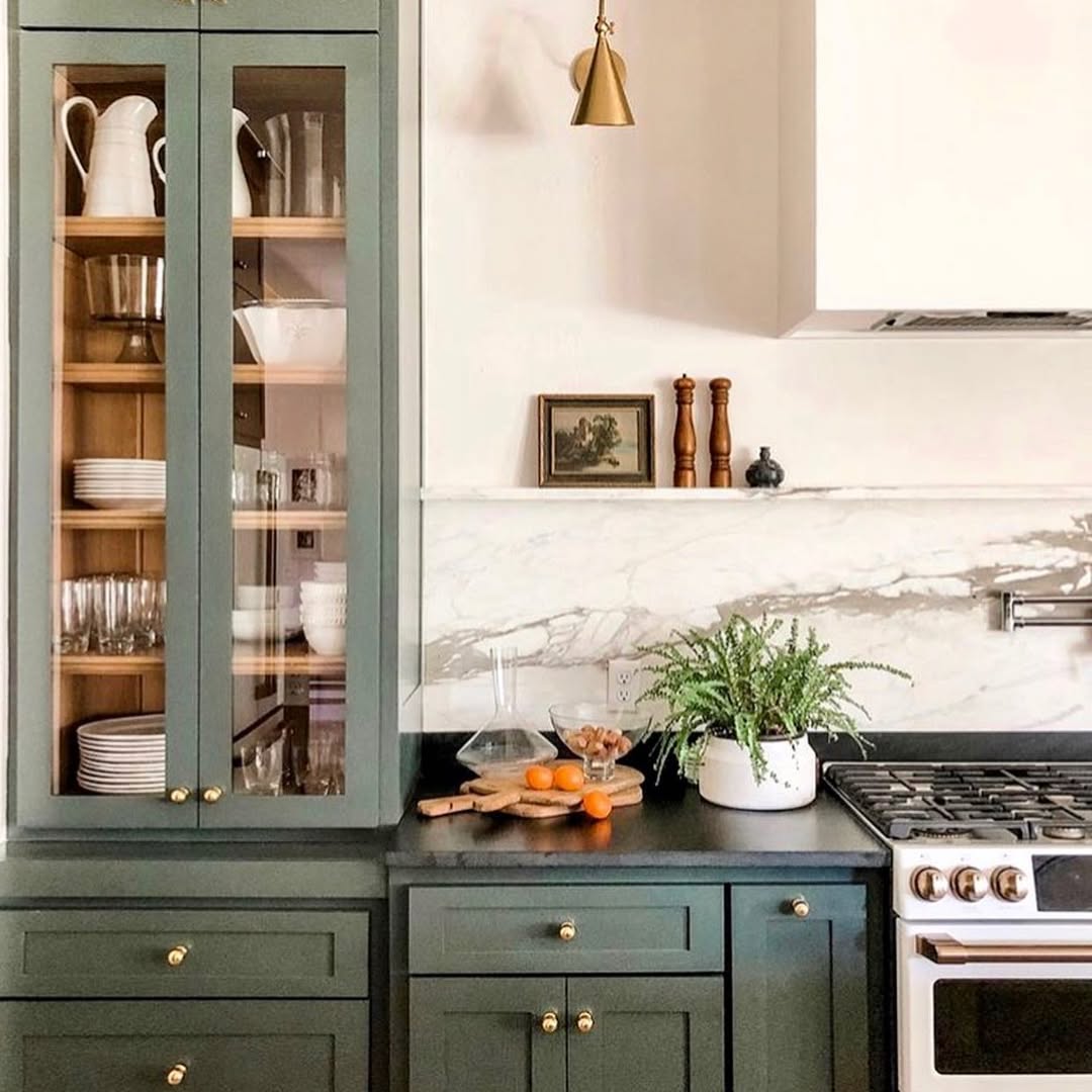
Pewter Green (SW 6208) by Sherwin-Williams
Pewter Green is an earthy, muted green that skews slightly toward gray. It’s a versatile shade that feels calm and modern which makes it ideal for both cabinets and walls. It’s an especially good choice for smaller kitchens or spaces with limited natural light because it won’t feel overpowering. I’ve seen it used on lower cabinets, paired with crisp white uppers, for a fresh yet grounded look.
Pewter Green also pairs beautifully with natural textures like butcher block countertops, stone backsplashes, or slate flooring. Add in some warm metallics—copper or brass—and you’ll have a kitchen that feels effortlessly pulled together.
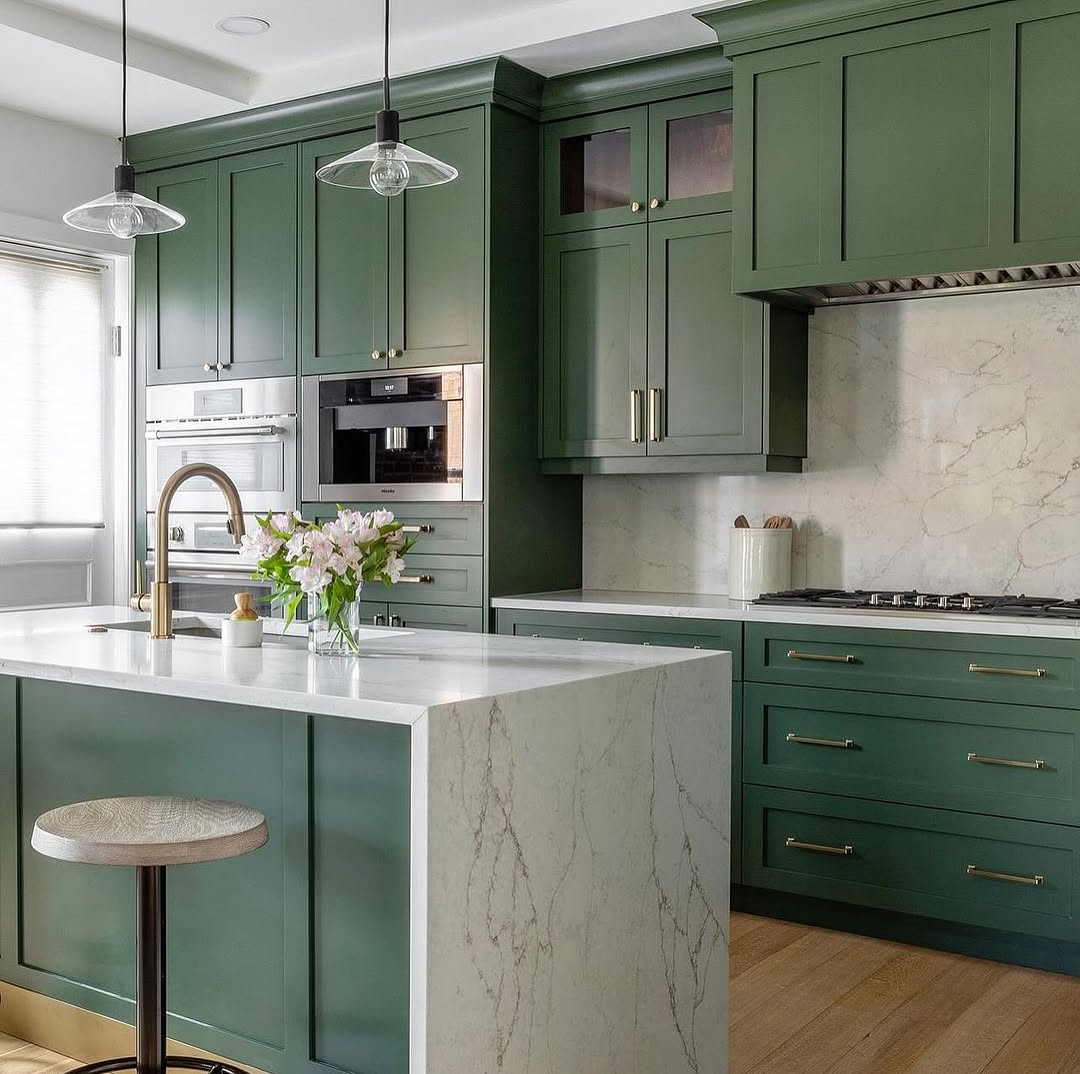
North Woods N410-7 by Behr
This deep green with subtle blue undertones has a crisp, refreshing quality that brings drama to any kitchen. It’s a great choice for kitchen islands or lower cabinets, especially when paired with lighter materials like white quartz or classic subway tile.
This shade loves the spotlight, so let it be the star by keeping the rest of your palette simple and neutral. If you want to create contrast, consider adding gold or matte black fixtures. North Woods is a statement maker, no doubt about it, but it still manages to feel refined and approachable.
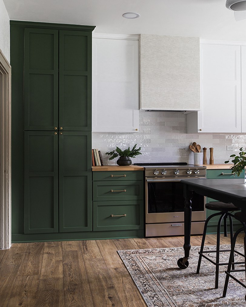
Windsor Green CW-505 by Benjamin Moore
Windsor Green is one of those colors that feels rooted in history but still works beautifully in modern spaces. It’s a deep, traditional green with just enough softness to keep it from feeling heavy. If your kitchen leans toward a farmhouse or classic style, Windsor Green is a natural fit. Use it on shaker cabinets, a kitchen hutch, or even a pantry door to add a touch of timeless charm. This shade pairs effortlessly with warm wood finishes and creamy whites, creating a palette that feels cozy and inviting. To give it a more contemporary twist, pair Windsor Green with sleek hardware and bold lighting fixtures.
Decades of Combined Expertise
Best Buy Guidebook is a culmination of online publishing lessons learned. From SEO to paid ads, our team has experienced the highest of highs and the lowest of lows. Our goal now is simple: Arm readers with the most information possible.