Office Paint Colors for 2025: What’s In and What’s Out
If you’re itching to repaint your office, you’re in luck because some truly game-changing color trends are emerging. These office paint colors aren’t just about what’s “in” – they’re designed to improve your workspace, boost morale, and support focus. Let’s explore the emerging trends in 2025 and others that are being shown the door.
1. Terracotta
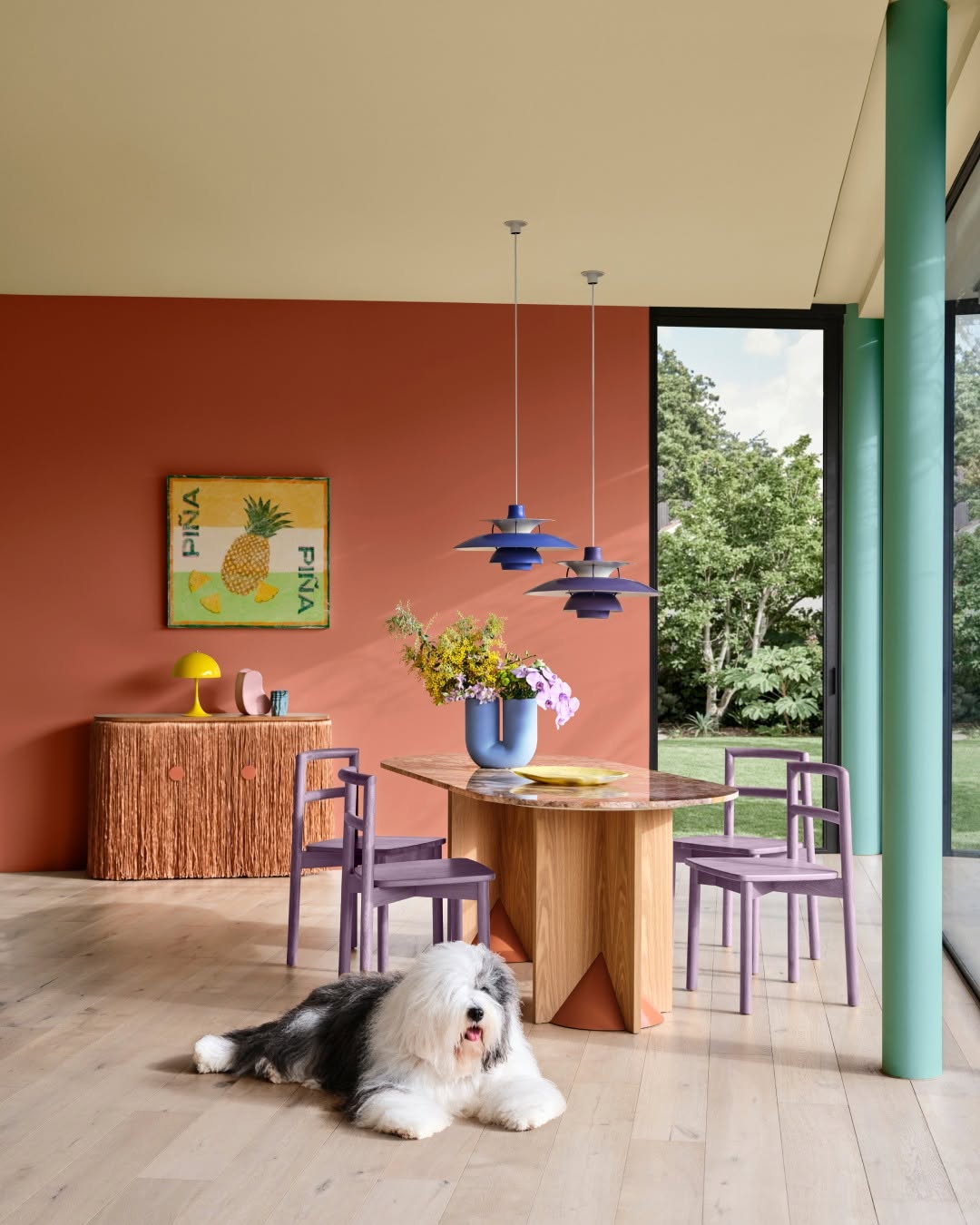
Terracotta’s not just a trendy color—it actually enhances your mood. This rich, earthy color will provide warmth to any office without feeling overly intense. The beauty of terracotta is its versatility; it can be used in creative spaces or even in more professional settings like meeting rooms. It also pairs beautifully with natural wood, green plants, and even dark metals. It’s like nature brought indoors but in a sophisticated way.
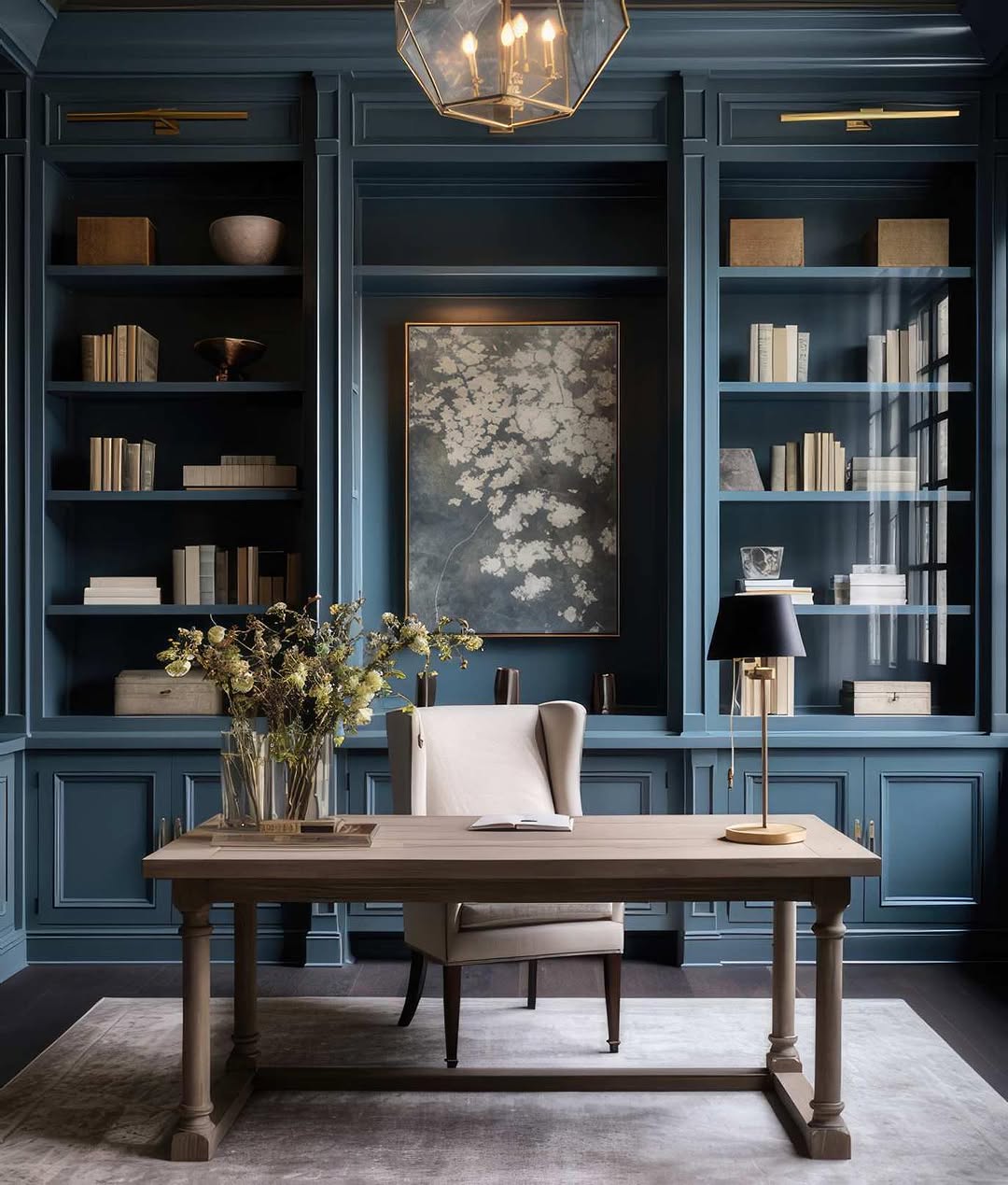
Navy blue is making a comeback as a major color for offices. This color is a classic for a reason—it’s calm, it’s professional, and it’s reliable. In an office setting, it exudes trust and competence. Navy blue works incredibly well in spaces where focus is crucial, such as conference rooms or executive offices. It’s the kind of color that promotes clarity and concentration and is perfect for high-stakes meetings or brainstorming sessions. If you’re worried about navy feeling too dark, balance it with light wood accents or white trim to create contrast.
3. Muted Green
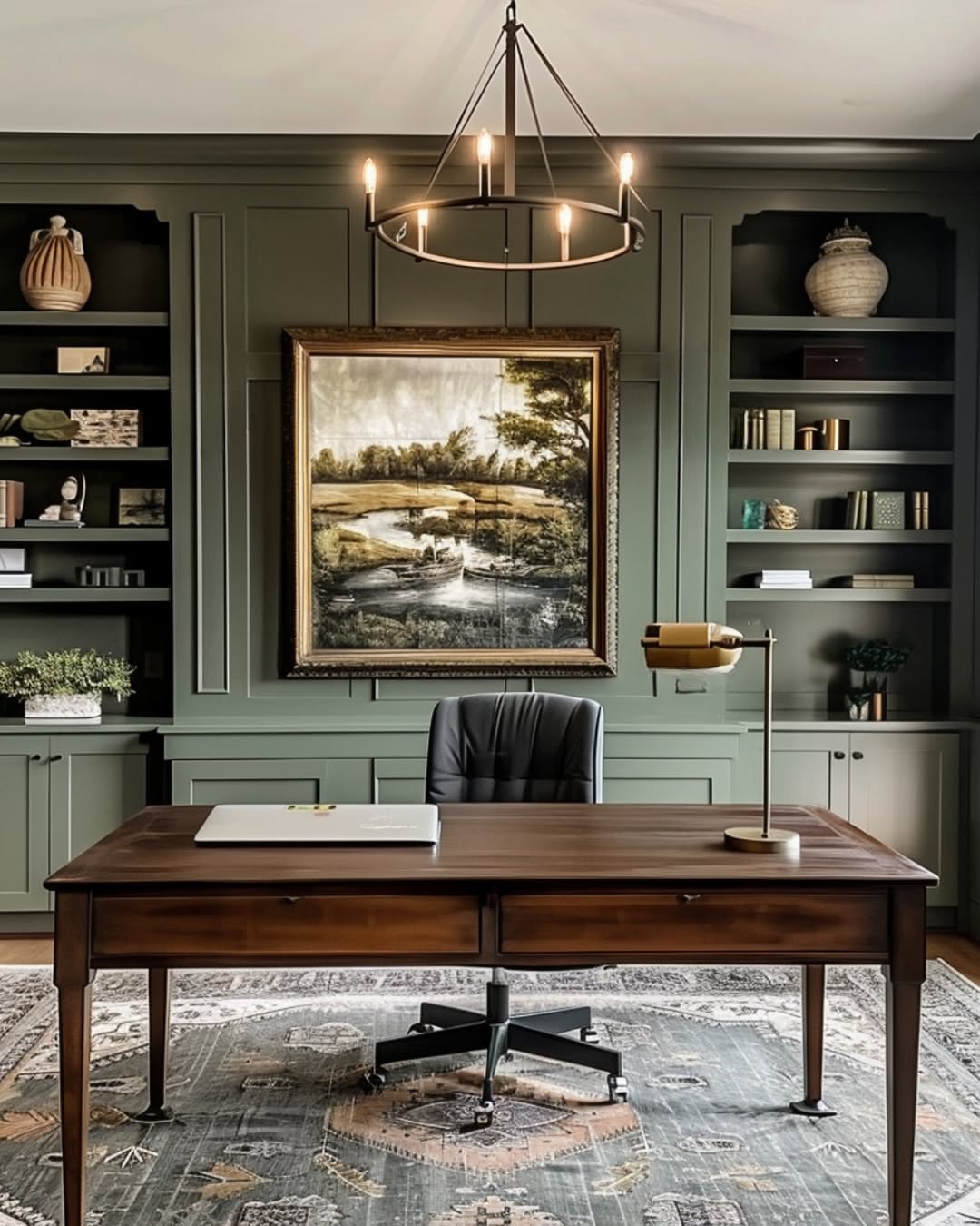
Sage, olive, and moss are colors that remind us of nature’s calm. These muted greens are taking over office spaces in 2025, and for good reason. Green is known for its soothing qualities, and when you tone it down, it becomes a perfect backdrop for creative thinking. It’s ideal for workspaces where you need peace but still want a bit of vibrancy. Plus, green can help reduce stress and anxiety, which is exactly what you want in a high-pressure office environment. You can pair it with natural light and a few indoor plants, and you’ve got yourself a calm, productive space.
4. Warm Beige
I get it; beige might seem boring at first. But warm beige—think soft caramel or sandy tones—has quietly made a comeback. Besides being calming and welcoming, this neutral color helps you create an atmosphere that doesn’t distract from the task at hand. In large office spaces or open-plan setups, beige can make the room feel bigger, lighter, and less cluttered. It’s a great color to pair with bold accent pieces or textured furniture. If you’re going for a classic, professional vibe, warm beige is definitely worth considering. It lets the furniture and accessories do the talking while still adding that quiet, stylish touch.
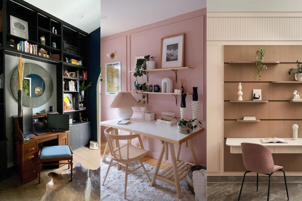
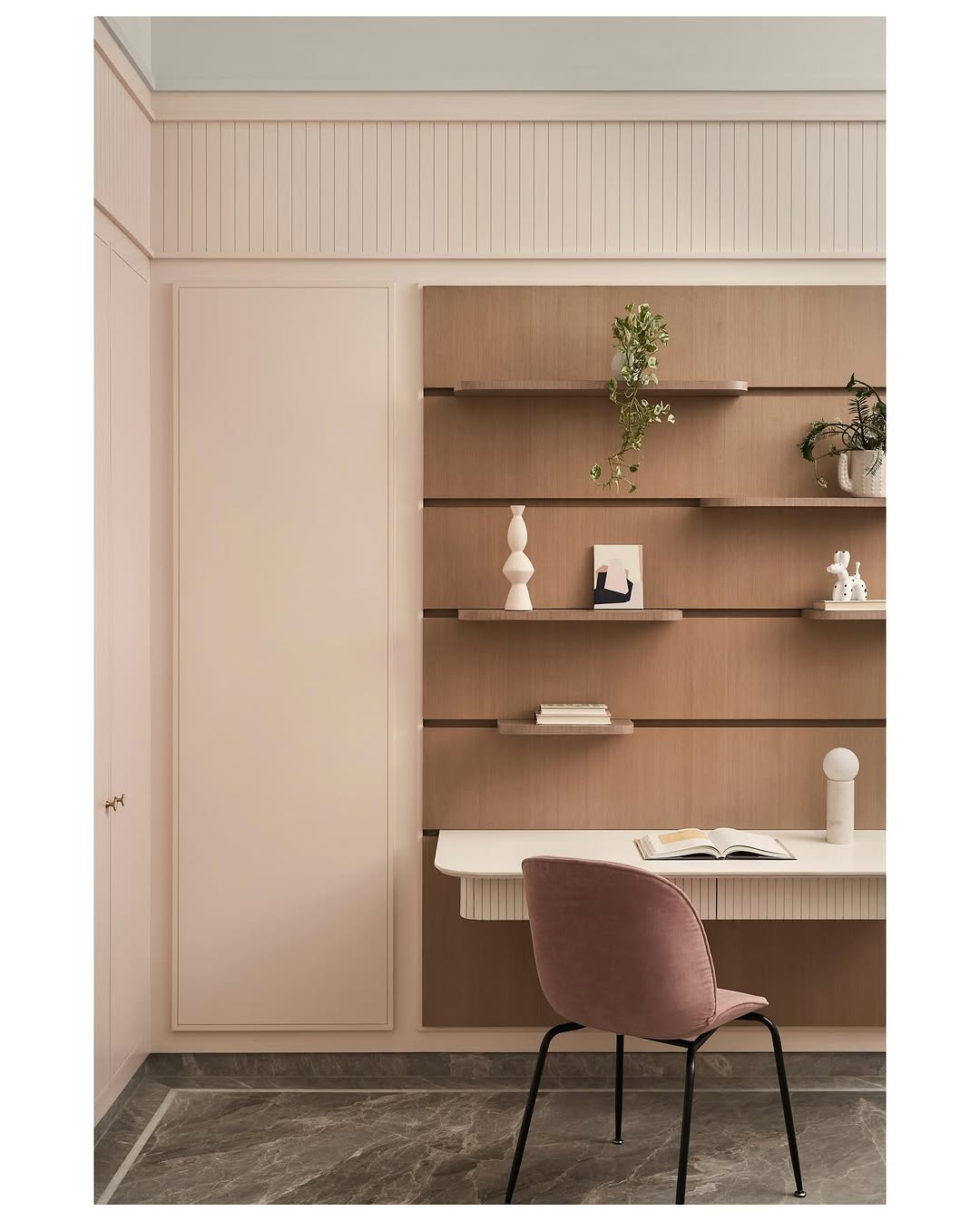
5. Dusty Rose
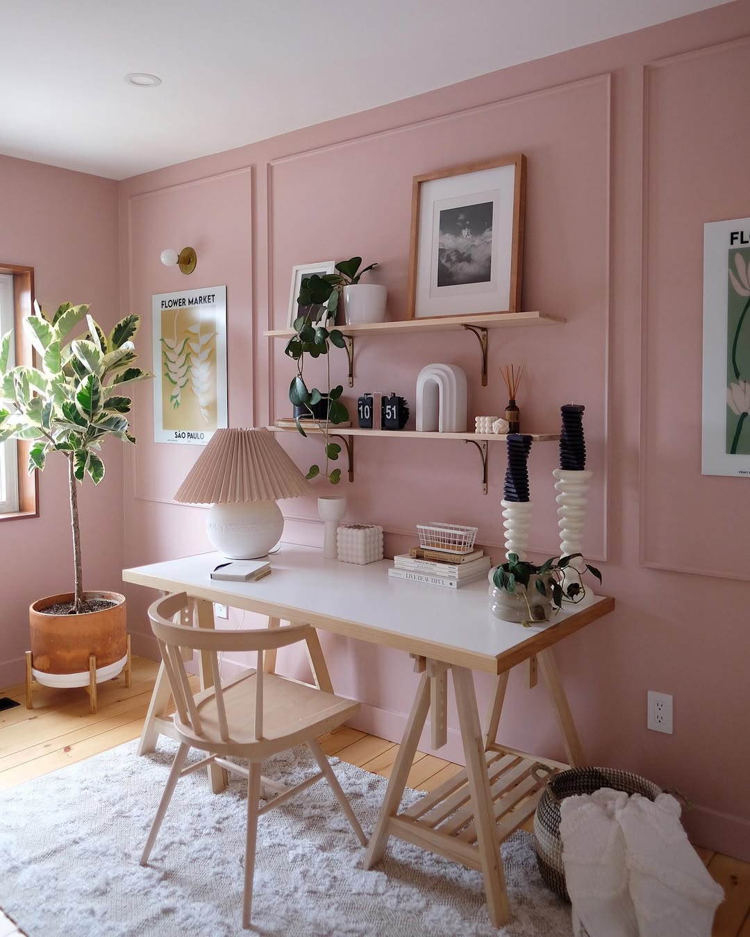
This isn’t your typical Barbie pink. Dusty rose is a more muted, sophisticated version of pink. It is warm, inviting, and modern. It’s the perfect way to add a little color without going over the top. Lately, dusty rose has been showing up in office spaces because it sparks creativity without feeling too intense. It’s ideal for areas where you want a light, positive vibe, like break rooms or lounges. Plus, it pairs so well with soft grays, whites, and even brass accents to create a balanced look that feels both chic and calming.
6. Soft Gray

Soft gray is still a go-to for office spaces, and it’s easy to see why. It’s understated, professional, and versatile, and creates a calm atmosphere while allowing other design elements to shine. If your office has big windows or lots of natural light, soft gray is perfect—it reflects the light without being as harsh as white. And if you’re aiming for a modern, minimalist look, you can’t go wrong with this classic shade. It’s understated but never boring.
7. Charcoal

If you want a little drama without going all-in on black, this one’s it. It’s deep, sophisticated, and has that modern edge. It is perfect for accent walls, feature areas, or even private offices. What’s great about charcoal is how easily it pairs with both bright, bold colors (like teal or mustard) and softer neutrals (think whites or light woods). It’s the color that says, “I’m serious,” but still keeps things stylish and approachable. The charcoal will give your space a bold and modern look while maintaining a professional feel throughout the space.
Office Paint Colors to Skip
This year, certain colors are starting to show their age, especially in office settings. Some bold choices that were once considered edgy are now making way for more thoughtful, calming colors. If you’re looking to refresh your office, it’s time to say goodbye to these colors.
1. Bright Yellow
Bright yellow might seem fun and uplifting, but it can be a little too much for the office. While yellow is associated with creativity, the neon variety can be jarring and overstimulating. Too much of it can even lead to anxiety. Instead, opt for softer, mustard yellows or gold tones, which bring the warmth of yellow without the harshness. Use it as an accent color rather than covering walls with it. Yellow should add warmth, not distract from the task at hand.
2. Neon Colors
Neon greens, pinks, and blues are more likely to cause distraction than anything else. In an office where focus is key, neon colors can interfere with productivity. They’re great for party decorations or retail displays, but not ideal for professional settings. If you like color, stick with softer, more muted tones that still bring energy but don’t overwhelm your space.
3. Electric Blue
Electric blue is a bit too bold for an office space. While blue is known for its calming qualities, the electric variety can feel intense and even stressful. It’s a color that demands attention in all the wrong ways, and it can make a room feel colder and less inviting. For a similar effect that’s less jarring, opt for deeper blues like navy or cobalt. These shades retain the cool, calming qualities of blue but won’t feel overbearing.
4. Bright Red
Red is the color of passion and power, but when used too liberally in an office, it can quickly become overstimulating. Bright red can increase stress levels and distract from the task at hand. If you want to bring energy into your office, use red sparingly, like in artwork or small accents. For larger spaces, opt for deeper shades like maroon or burgundy, which provide the warmth and richness of red without the intensity.
5. Purple
Purple definitely has that creative, “wow” factor. But if you go too bold with it, you risk turning your office into a royal circus. Bright purples can quickly feel too much for a workspace—it’s like someone trying to get your attention nonstop. Instead, try soft lavender or a deep plum. These shades still bring that creative vibe but with a little more grace and maturity. They let you stay inspired without stealing the spotlight.
6. Black
Black walls are cool if you’re going for that moody, edgy look at home—but in an office? Not so much. Black can make a room feel cramped and heavy like it’s swallowing all the light. It’s dramatic, sure, but not in the best way when you’re trying to keep things light and productive. Swap it out for charcoal or a deep gray. These colors still give that sleek, sophisticated vibe but without the suffocating feeling that black can bring. You’ll get the same stylish edge but with a more open, airy feel.
Decades of Combined Expertise
Best Buy Guidebook is a culmination of online publishing lessons learned. From SEO to paid ads, our team has experienced the highest of highs and the lowest of lows. Our goal now is simple: Arm readers with the most information possible.