How to Pick the Perfect Paint Color for Your Home
When we plan to paint our homes, we find ourselves grappling with a few fundamental questions about colors: what colors to choose, how to know which color matches the interior of our spaces, and how to combine different colors to bring something unique. Considering these questions is important because choosing paint colors for your home isn’t just about picking a shade from a swatch—it’s about shaping the atmosphere and setting the tone for every moment you spend there. We have a number of colors – warm colors and cool colors – and they influence emotions, shift perceptions of space, and set the mood for every room. So when you’re deciding on your palette, it’s more than just personal taste—it’s about creating a space that feels like home and serves its purpose beautifully.
Before going forward with how you can choose colors for your home, first, let’s discuss what warm and cool colors are.
Warm Colors and Cool Colors: What’s the Difference?
Warm colors—reds, oranges, yellows, and everything in between—bring that cozy, inviting vibe. Think of a glowing sunset or the heat of a bonfire. These colors have a way of making spaces feel alive, whether it’s a bold red or a soft golden yellow. They tend to grab your attention and create a sense of energy and comfort.
Cool colors, like blues, greens, and purples, are a whole different story. They remind you of the calm of the ocean, the sky, or a peaceful forest. These shades are all about relaxation—soft blues, deep greens, and cool purples have a way of making a room feel peaceful and airy. They’re great for spaces where you want to unwind and feel at ease.
Lighting’s Role in Color Selection
Here’s a tip that can save you from paint-related heartbreak: always consider lighting. Natural light can dramatically influence the perception of color, with its intensity and direction varying throughout the day. Zahira Cury, an architect and interior designer, emphasizes the importance of evaluating the conditions of your space: “For example, if when evaluating the space you identify that direct sunlight doesn’t enter the room, it may be convenient to use light colors to take advantage of the little natural light in the room and thus make it more efficient.”
Artificial lighting also has a significant impact. Warm bulbs may enhance the coziness of warm tones, while daylight bulbs bring out the crispness of cool tones. Testing paint samples under different lighting conditions can help ensure your chosen palette works harmoniously with the light sources in your home. As Zahira wisely states, “It is crucial to evaluate the individual and the space conditions in interior design to obtain the best results.”
She also notes that factors like window direction and outdoor surroundings, such as landscaping, can affect how colors appear inside.
Let the Room’s Purpose Guide You
Each room in your home serves a different purpose, and the colors you choose should reflect that. As Zahira explains, “The first thing you should do is answer some questions about the functionality of the space… what is the function and purpose of the space? What mood do you want to create in that space? Which colors will help you achieve that mood?” These considerations help ensure that the chosen colors align with the room’s purpose.
Active, social spaces like kitchens or living rooms thrive with warm, engaging tones. In contrast, private, restful areas like bedrooms or reading nooks benefit from cooler or neutral shades. For instance, a deep crimson wall in the dining room can spark lively dinner conversations, while a dusty blue in a home library can create the perfect meditative atmosphere. By aligning your colors with the room’s purpose, you’ll create spaces that truly work for you. Colors, as Zahira points out, “can transform a space… they can enhance feelings of health and well-being, make your space feel larger, warmer, or cozy, or even energize static areas.”
Cohesive Color Schemes Create Flow
Even though each room has its unique vibe, a cohesive color scheme ties everything together and gives your home a sense of harmony. Start with a base color—a neutral or soft tone that can anchor your palette—and build from there. For example, warm beige walls in the main living areas can transition beautifully into deeper terracotta in the dining room and muted yellows in the hallways. Using similar undertones ensures the colors flow seamlessly, making your home feel unified and well-designed.
Consider Using Accent Colors
Accent colors can really change the vibe of a room, and they don’t have to be loud to make an impact. They’re perfect for adding some interest and life without overpowering the space. For example, if your bedroom is mostly neutral, a few mustard-yellow pillows or a rust-colored throw can do wonders to liven things up. Want to highlight architectural features like built-in shelves or crown molding? A warm accent color can make those details stand out, while cooler tones can bring a more sophisticated feel. The trick is in choosing accents that complement your main colors, so everything feels well thought-out and cohesive without being too much. When done right, accent colors can really pull a room together.
Sampling Paints
Buying paint samples might feel like an extra hassle, but it’s absolutely worth it. Paint colors often look different in your home than they do on a tiny swatch under store lighting. Apply samples to multiple walls and observe them at different times of the day to see how they change with the light. This hands-on step can prevent the disappointment of discovering your dream color doesn’t work as you’d hoped once it’s on the wall.
Balancing Bold Choices with Neutrals
Bold colors definitely make a statement, but the trick is to balance them with neutrals to keep the room feeling grounded. Take a rich emerald green wall, for example—it really pops when paired with soft beige or a clean white. Similarly, warm tones like brick red can feel more balanced and relaxed when combined with taupe or cream. Neutrals don’t compete with those bold shades; instead, they help tone things down and make everything feel a bit more pulled together. Plus, they give you flexibility if you want to change up your decor later on without having to completely redo the space.
The 60-30-10 Rule
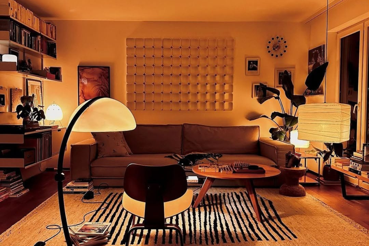
If you’re unsure how to balance your colors, the 60-30-10 rule is a tried-and-true guide. Use one color for 60% of the room (walls and large furnishings), a secondary color for 30% (rugs or upholstery), and an accent color for the final 10% (decor and accessories). For instance, in a living room, you might opt for warm beige walls (60%), a rust-colored sofa (30%), and gold-accented pillows or artwork (10%). This method creates a visually appealing balance without feeling chaotic.
Trust Your Instincts
At the end of the day, no rule or trend should outweigh your personal preferences. If a bold coral wall makes you smile every time you see it, then it’s the right choice for your home. Likewise, if minimalist white interiors bring you peace, embrace that aesthetic. Your home should reflect your personality and make you feel comfortable. Trusting your instincts will lead to a space that feels authentic and uniquely yours.
Decades of Combined Expertise
Best Buy Guidebook is a culmination of online publishing lessons learned. From SEO to paid ads, our team has experienced the highest of highs and the lowest of lows. Our goal now is simple: Arm readers with the most information possible.