6 Bathroom Color Trends That Are Officially Over in 2025
Some bathroom color trends are quietly falling out of favor in 2025, and it’s not hard to see why. After years of seeing the same shades repeated across remodels—cool grays, blush tones, high-gloss whites—designers and homeowners are starting to move in a new direction. The shift isn’t dramatic, but it’s noticeable: more warmth, more texture, and a stronger sense of place.
The bathroom isn’t treated as a blank, neutral space anymore. People want rooms that feel intentional, not showroom-ready. And when a color starts making a space feel tired—or worse, dated—it tends to get replaced fast. Based on what designers are choosing now and what clients are asking to replace, here are the bathroom colors that are officially past their peak this year.
Bathroom Color Trends That Are Officially Over in 2025
If you’re updating your space, these are the colors designers are leaving behind—for good reason.
1. Cool Gray Everything
Cool grays were once the gold standard. You could paint an entire bathroom in pale silver and be guaranteed compliments. But now they feel more like an office lobby than an oasis.
Designers are walking away from those icy, flat tones that used to pass for neutral. They don’t reflect warmth, they don’t play well with wood or brass, and under the wrong light, they can make even the cleanest bathroom look a bit washed out. These days, warmer alternatives like mushroom, putty, or oatmeal tones are filling that void—still neutral, but far more comforting.
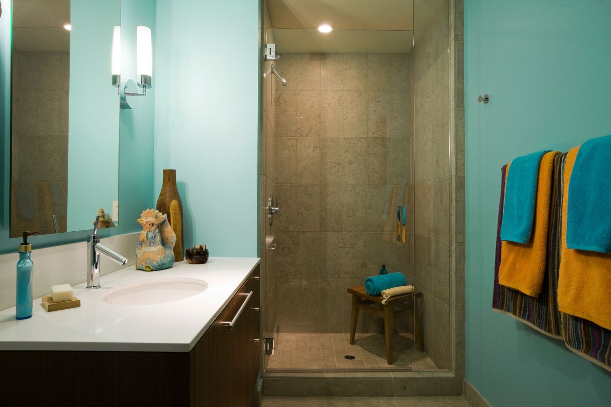
2. Aqua Blues That Scream “Beach House”
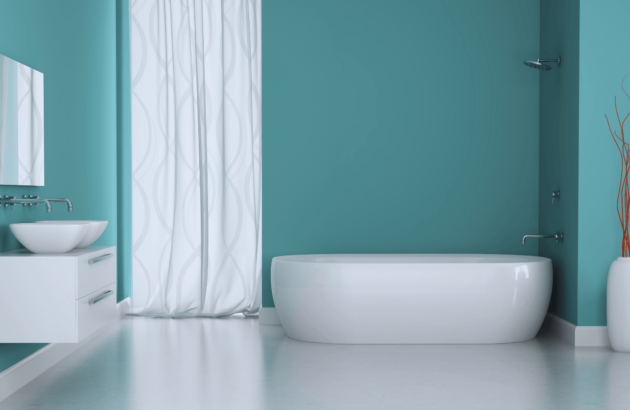
Aqua had its time, especially in bathrooms aiming for that easy, beachy vibe—but by now, it’s starting to feel a little too on-the-nose.
It’s not that blue is out. Far from it. But the blues of 2025 are deeper, moodier, and more mature. Think of the color of denim after it’s been worn in, or the dark edge of a storm cloud. Aqua feels too punchy now—too Pinterest-in-2014. If your bathroom still leans into those beachy pastels, you might find a more grounded shade gives the room the sophistication it’s been missing.
3. Matte Black Overkill
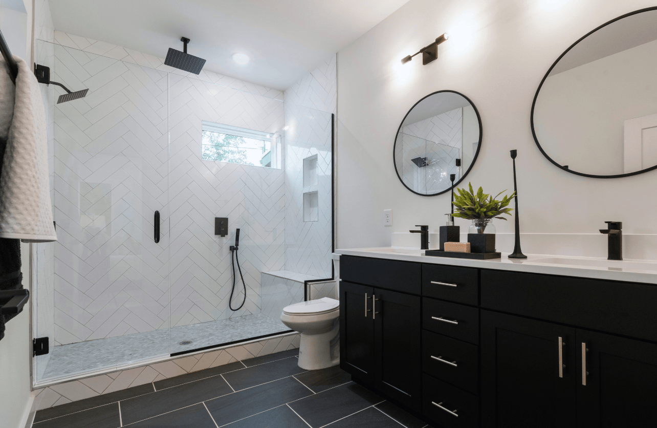
Matte black had its moment, no question. Faucets, mirrors, handles—even full vanities. It felt bold. Sleek. Modern. But the problem with a trend that intense is that it burns out fast.
What once made a statement now feels a little too serious. Matte black can still work, but when it takes over the room, it quickly starts to feel heavy. Instead, designers are using black with restraint—just enough to frame a mirror or ground a shelf, not overwhelm. In its place, we’re seeing rich bronze, aged iron, and dark walnut finishes with depth and a little bit of soul.
4. Blush Pink Walls
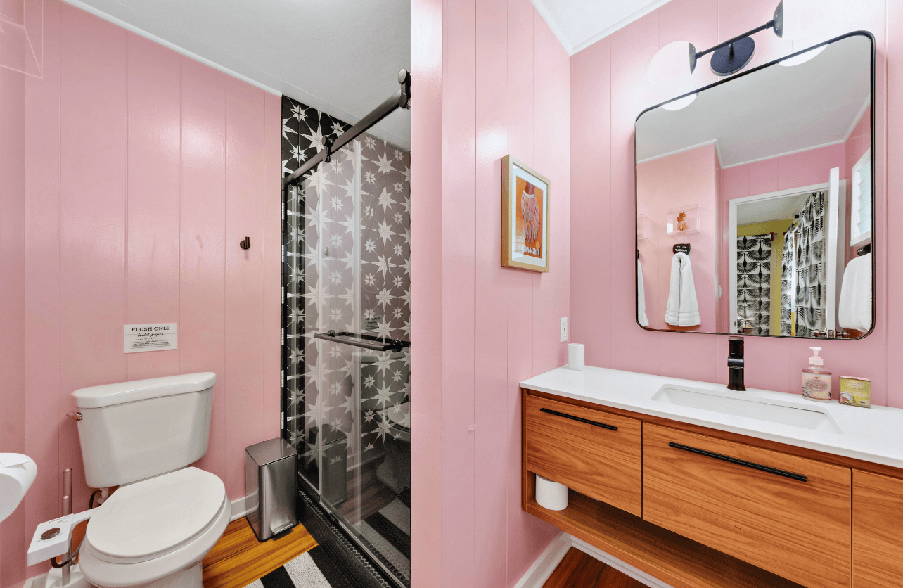
Blush pink doesn’t bring the same quiet charm it once did. In 2025, it’s reading more staged than stylish—like it’s clinging to an aesthetic that’s already moved on. The tone doesn’t play well with most lighting, either. Under warm bulbs, it turns muddy; in cooler light, it can look oddly flat.
The pairing of blush with gold fixtures and marble finishes has been done to the point of exhaustion. What started as soft and modern now feels overly styled. If pink still feels right to you, try shades with more earth to them—terracotta, dusty rose, clay. They keep the warmth but add a bit of grit, and that’s exactly where color is headed now.
5. High-Gloss White Everything
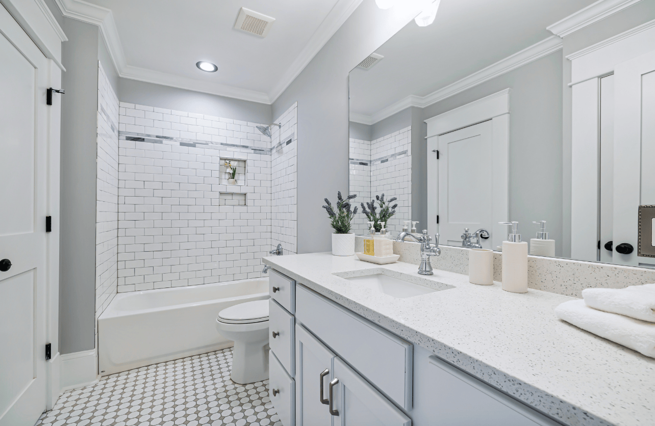
White will never go away entirely—it’s clean, classic, and makes a small space feel larger. But those glossy, ultra-bright whites that once defined “modern” bathrooms are looking less fresh and more like an operating room.
The issue isn’t just the glare or the maintenance (though fingerprints and water spots certainly don’t help). It’s that these spaces lack texture. They don’t feel lived in. Designers are now layering in off-whites with satin finishes, textured tiles, and natural accents—materials that invite light without bouncing it like a spotlight.
6. Sage Green Overload
This one might sting. Sage green has been everywhere—painted on cabinets, covering tile, and woven into textiles. It was soft, it was calm, it was the answer to gray fatigue. But in 2025, it’s starting to look a bit… expected.
That’s not to say green is out. Far from it. But designers are shifting toward shades with a little more depth and grit. Olive. Laurel. Eucalyptus. These greens still feel connected to nature but aren’t quite as delicate.
Decades of Combined Expertise
Best Buy Guidebook is a culmination of online publishing lessons learned. From SEO to paid ads, our team has experienced the highest of highs and the lowest of lows. Our goal now is simple: Arm readers with the most information possible.