Yellow Is Taking Over Summer Decor—And It Works
Yellow is showing up everywhere this season, from painted ceilings to front doors and soft accents in powder rooms. But this isn’t the jarring neon version of the past. Today’s shades are warmer, more layered, and surprisingly versatile. Yellow paint, in particular, feels especially well-suited for summer. It brings light, softens hard edges, and adds a gentle sense of optimism that works across a range of spaces.
That said, it can still feel like a bold choice. Even seasoned designers hesitate. “I also was scared of color for years,” says Christian Dare, designer and Cityline contributor. “Even as a designer, and even when you try and talk to clients about it, they get scared of color.” But yellow has a disarming charm. “Even when we both walked on here, instant smiles when we rolled out a giant yellow wall.”
Used with care, yellow paint doesn’t overwhelm—it uplifts. It changes not just how a room looks, but how it feels.
Where to Start With Yellow Paint
The charm of yellow lies in its range. There are pale, buttery shades that feel quiet and sophisticated. Then there are punchy brights that wake up a room like espresso.
Christian Dare mentions a favorite from Benjamin Moore: “Bright Yellow is amazing in kitchens. It’s also great in a front hall—and if you’re scared of doing your whole hall, it’s actually amazing on your front door. It’s an instant pop.” For something softer, he suggests Mustard Field. “It would look amazing in a library or office. It’s got a bit of gray to it, which makes it more palatable—almost like Dijon.”
If your style leans more subtle, Dare recommends using pale yellows in smaller spaces. “Goldtone and Mellow Yellow are actually really good in powder rooms. You don’t want to do a bright yellow because it actually will change the color of your skin.” It’s also a good choice for kids’ spaces. “They actually say yellow produces creativity,” he says. “You want a creative kid, right?”
Paint Isn’t Just for Walls
One of the smartest ways to use yellow? Look up. “Paint your ceiling yellow,” Dare suggests. “It’s almost like instant sunshine shining down on you.” That little shift—treating the ceiling as the “fifth wall”—lets you add color in a way that feels unexpected but not overwhelming. It’s a trick that adds brightness without compromising balance in a room.
Yellow also pairs beautifully with other neutrals. For example, you can combine Benjamin Moore’s Horizon Gray alongside a yellow called Sun Porch to paint your wall. This combination works perfectly, but the key is proportion. Dare suggests a two-thirds to one-third split when combining bold colors.
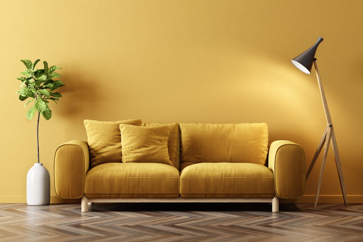
Furniture That Makes a Statement
For this season, many people are leaning towards yellow furniture. Furniture is one of the most effective ways to make a bold, seasonal impact with color. A yellow sideboard, a set of dining chairs, or even a single sculptural lamp can shift the mood of a space instantly.
In open-concept areas or minimalist interiors, yellow storage units or bookshelves offer both function and visual interest. A saturated yellow tone can act almost like artwork, especially when contrasted with clean neutrals or natural wood. For outdoor spaces, lightweight yellow chairs are an easy way to carry that brightness onto a balcony or patio, blurring the line between indoors and out.
Even small-scale pieces, like stools or side tables, bring the same effect. They don’t overwhelm the room, but they still draw the eye and energize the space. The key is placement. Let yellow sit in a spot that catches the light or breaks up a muted palette, and it becomes a moment of sunshine, without the commitment of paint.
Yellow Wallpaper
If you want depth without the brushwork, wallpaper is an easy win. “These are some great wallpapers… House of Hackney and Timorous Beasties… it’s a great way to incorporate yellow,” Dare notes. Whether you lean into botanical patterns or something more graphic, the range of yellow-based prints out there right now can give any room a fresh update.
Wallpaper brings in another element: texture. It softens the yellow just enough to keep it interesting while adding layers to a space. And when paired with clean-lined furniture or a neutral palette, it feels thoughtful rather than overpowering.
Art, Rugs, and the Easy Wins
Art is one of the most underrated ways to introduce yellow into a room. A bold print, a graphic canvas, or even a framed textile in golden tones can act as a focal point, especially in spaces that lack natural light. Yellow in artwork often feels modern and fresh, yet still approachable—it invites attention without dominating the space.
Floors, too, offer a perfect opportunity for color. A well-placed rug in ochre, lemon, or marigold can ground a room while adding subtle warmth. Flatweaves and low-pile options work well in high-traffic areas like entryways or kitchens, while plush styles bring softness to living rooms or bedrooms. Layered over wood or tile, a yellow rug adds dimension and brightness in one simple move.
If you prefer something easily swappable, seasonal accessories offer flexibility without the long-term commitment. You can go with throw pillows, lampshades, ceramic vases, or even a bundle of fresh yellow flowers on the table. These small additions work across styles and spaces, giving rooms just enough lift to feel refreshed, without needing a full makeover.

Decades of Combined Expertise
Best Buy Guidebook is a culmination of online publishing lessons learned. From SEO to paid ads, our team has experienced the highest of highs and the lowest of lows. Our goal now is simple: Arm readers with the most information possible.