Why White Kitchen Walls Might Be a Design Mistake (And What to Do Instead)
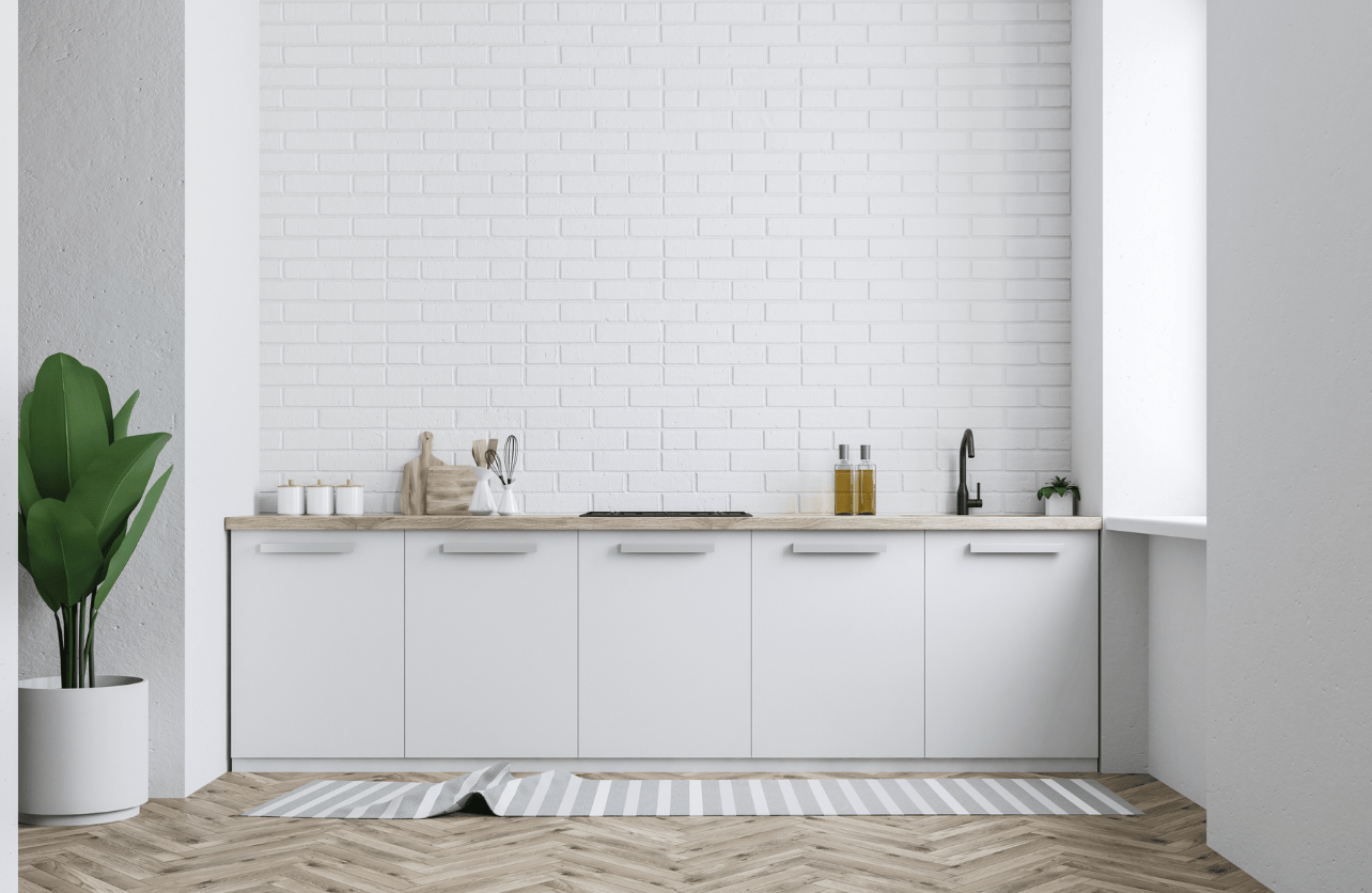
Rarely does one walk into a kitchen and see wall colors beyond white, and it makes sense why. White is a default in home design: it’s associated with freshness, cleanliness, and simplicity. It reflects light well, makes small spaces feel open, and seems to pair effortlessly with every cabinet, counter, and fixture. But design trends often overlook what it’s like to live with something every day. White kitchen walls, while visually crisp, tend to behave very differently in real homes. They show smudges, grease, splashes, and handprints more than any other color. In low-light kitchens, they can fall flat. And for spaces meant to feel warm and personal, an all-white backdrop can end up feeling more clinical than comforting.
None of this means white should be ruled out entirely. But its default status deserves a second look, especially for those who want their kitchen to feel like a reflection of how they live, not just how it photographs. Here’s why white kitchen walls might be holding your space back, and what to consider instead.
1. White Kitchen Walls Put Every Mark on Display
White reflects more than just light—it puts everyday kitchen life on full display. Splashes of oil, sauce stains, condensation drips, and even the brush of a hand leave visible trails. In high-use kitchens, walls often show signs of wear almost immediately, especially around the stove or near prep zones.
Even washable finishes don’t hide smudges; they only make them easier to clean. But needing to wipe walls constantly just to keep them presentable can become exhausting.
What works better:
Warm-toned neutrals like greige, putty, or even light olive provide the same sense of openness while being far more forgiving. These shades mute daily messes without sacrificing brightness.
2. White Can Flatten the Space
Though white is often associated with spaciousness, it can have the opposite effect when overused. In kitchens with white cabinetry, white countertops, and white backsplashes, the walls can disappear into a monotone backdrop. Without contrast or texture, everything blends together, creating a flat, unfinished appearance.
In lower-light kitchens, especially those that face north, white can turn grayish and dull. Instead of bouncing light around the room, it can wash everything out and make the space feel lifeless.
What works better:
Muted earth tones, such as pale clay or smoky blue, add contrast and give the room a grounded feeling. These colors also play well with white or neutral cabinetry, helping to create a layered, intentional look.
3. It’s a Safe Choice, But Not Always the Right One
Choosing white often stems from a desire to keep things simple or to avoid making a design mistake. While there’s value in restraint, choosing a wall color out of fear tends to result in a space that feels unfinished or generic. A room designed to feel neutral shouldn’t feel forgettable.
Kitchens benefit from thoughtful color just as much as any other part of the home. The right tone can evoke comfort, creativity, and warmth—qualities that sterile white sometimes lacks.
What works better:
Colors like sage, dusty lavender, or warm taupe offer personality without being overpowering. These tones support a broader range of decor styles and evolve well with changing design preferences.
4. White Doesn’t Suit Every Style
White works well in minimalist, coastal, or Scandinavian spaces. But in kitchens with rustic beams, antique finishes, or warm-toned wood cabinetry, it can feel disconnected. Rather than enhancing the existing materials, stark white may clash with them or highlight imperfections in a way that disrupts visual harmony.
In historic homes or spaces with a lot of texture, white can come across as too sharp or modern. It lacks the depth needed to support more layered design aesthetics.
What works better:
Deeper neutrals or earthy shades, such as terracotta, olive, or charcoal, help create cohesion between architecture and decor. These colors enhance the warmth of organic materials and tie in more naturally with stone, wood, or iron finishes.
5. White Can Limit Design Flexibility Over Time
Though white is seen as a blank canvas, it can actually create restrictions. Once walls, cabinets, and fixtures are all painted white, adding contrast or color later can feel out of place. Decorative elements like artwork, lighting, or textiles may appear harsh or disconnected when placed against a backdrop that doesn’t support their tone.
In addition, intricate finishes—like marble veining, matte black fixtures, or handmade tile—often get lost in an all-white setting. Rather than enhancing standout features, white can neutralize them.
What works better:
Mid-tone colors that provide gentle contrast can highlight those special elements. A muted blue-gray, warm almond, or clay pink wall can elevate surrounding textures and surfaces without overwhelming them.
Decades of Combined Expertise
Best Buy Guidebook is a culmination of online publishing lessons learned. From SEO to paid ads, our team has experienced the highest of highs and the lowest of lows. Our goal now is simple: Arm readers with the most information possible.